The client in this project appears to be a brand called Funki Lab. Their primary goals were likely to establish a vibrant and cohesive brand identity, as seen in the style guides and branding materials showcased in the images. Here’s a breakdown of the project:
Client Goals
Visual Identity: Create a recognizable and appealing brand that reflects energy and inclusivity.
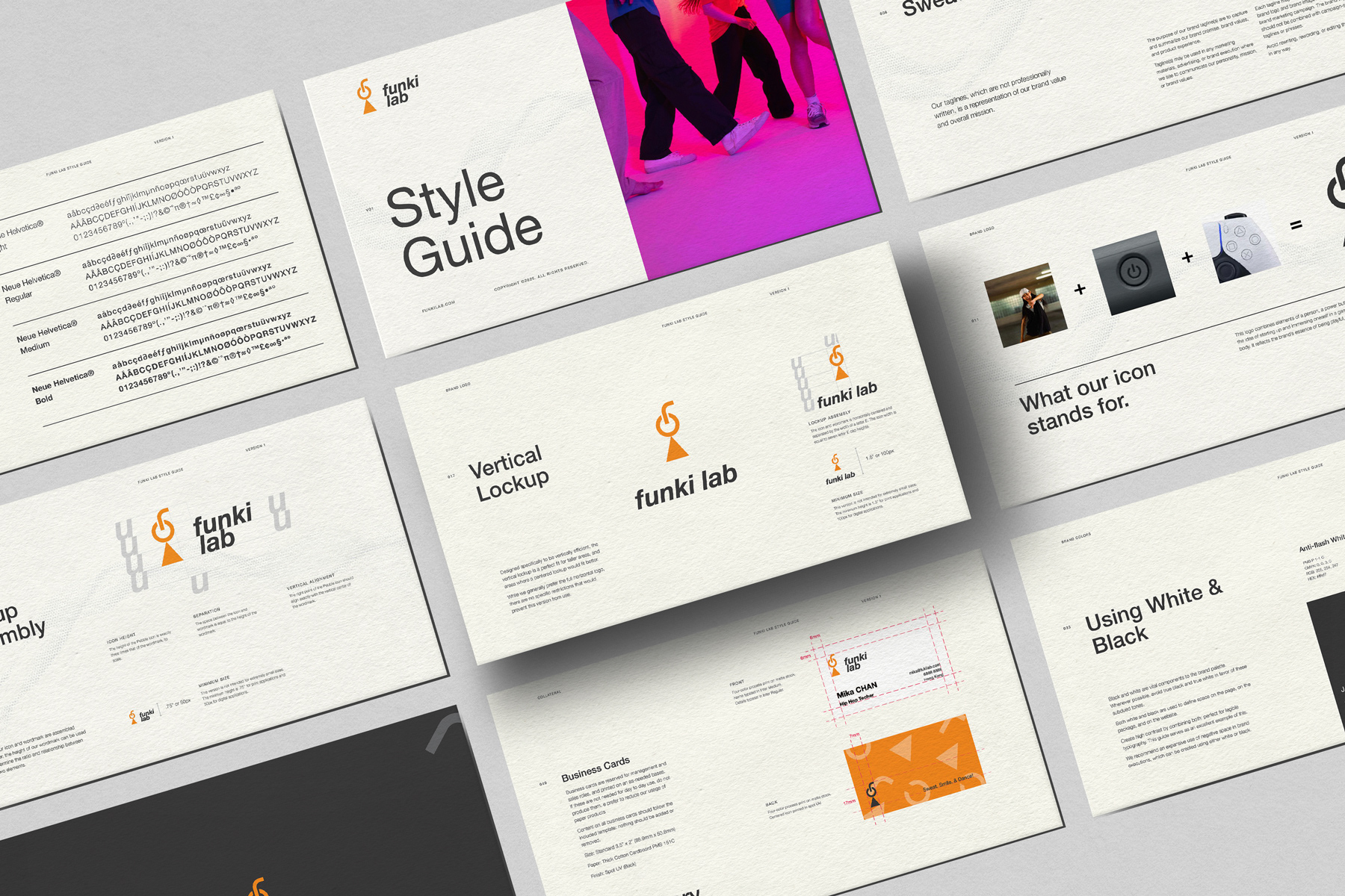
Consistency: Develop a style guide covering typography, color palette, logo usage, and tone of voice to ensure consistent branding across all platforms.
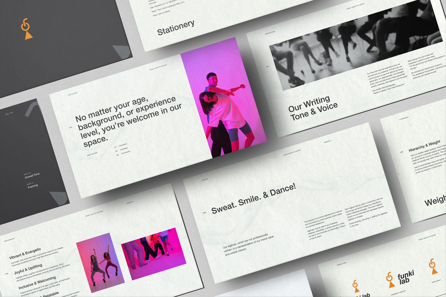
Brand Personality: Highlight values such as vibrancy, joyfulness, inclusivity, and an uplifting atmosphere.
Flexibility: Provide clear guidelines for using the brand across different mediums, such as signage, stationery, and digital platforms.
Challenges
Balancing Creativity with Structure:
The brand's playful and energetic personality needed to be balanced with professionalism and clarity to appeal to diverse audiences.
Ensuring Scalability:
The design had to work seamlessly across various formats, from large-scale signage to digital applications.
Communicating Inclusivity:
The brand needed to feel welcoming and approachable to people of all ages, backgrounds, and experience levels.
Solutions
Design Language:
The use of Neue Helvetica as the primary typeface ensures a clean, modern, and professional appearance, while the color palette (including vibrant tones like orange, blue, and pink) adds energy and vibrancy.
Clear Guidelines:
Comprehensive documentation of logo variations, placement rules, and typography ensures consistent application by different teams or vendors.
Visual Elements:
Incorporating imagery of diverse individuals and joyful, dynamic poses communicates inclusivity and energy.
Testing and Feedback:
Likely, iterations were made to refine the style guide based on client feedback, ensuring the final product met all objectives.
This project successfully blends creativity, structure, and inclusivity to position Funki Lab as a vibrant and welcoming brand.